1. The Intelligent Color
From a color psychology perspective,”Gray” is the color of neutrality being neither black nor white, it is the peaceful blending between two non-colors. The closer gray gets to black, the more dramatic and mysterious it becomes. The closer it gets to silver or white, the more illuminating and lively it becomes.
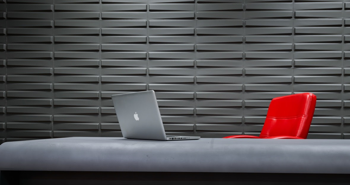
From a medical perspective, “Gray Matter” is tissue in the brain and spinal cord often associated with intelligence and the power of thought. What an amazing neutral it is! It provides the perfect backdrop for an accent color, like red or any other primary color. It is smart enough to interact with all other colors of the rainbow.
Being one of the more intelligent, sophisticated colors, gray creates a sense of calm, focus, safety and neutrality. It is a relief from a chaotic world, much like Switzerland!
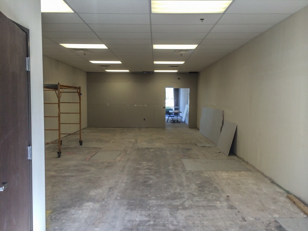
Before: Photography Studio
2.Blah to AHHH!!
PROBLEM: Well, the first problem is that the room is empty…LOL! The back wall is the first thing you see when you enter the studio so that needs to be the accent wall. However, there is a door that interrupts the flow of the wall. The challenge is to make that door disappear and create a cool focal point. So lets go from blah to ahhh!
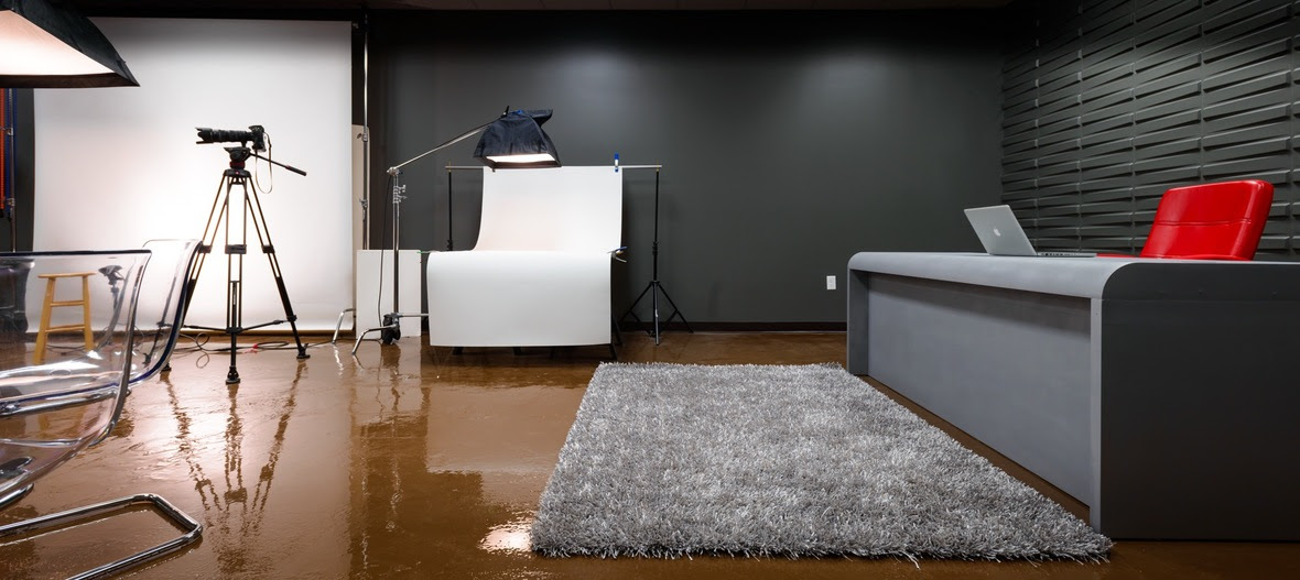
After: Photography Studio
3. POP of Red
SOLUTION: There are waaaay more than 50 shades of gray! Choosing just the right shade to enhance the work of the photographer was crucial. By painting the walls this dramatic deep gray (SW- 7068 Grizzle Gray), I created the perfect backdrop to display the art and to pepper bright pops of RED accents throughout the studio.
I also added 3D wall paper to create texture and interest on what would have been a very boring wall. I did not want to add art work on that wall as it would have taken away the focus from the photo display to the right. The 3D wallpaper is an inexpensive solution to instant texture. It is easy to install and is made of a sturdy hard cardboard composite.
Recent Comments